Slack’s got a new logo, obviously.
Well, this is obvious if you use Slack. I knew immediately, because it took me an extra 12 seconds to even find the app icon on my phone that I use dozens of times a day.
I’m not sure how I feel about it yet. So I’m going to work through it here in this post.
For those of you who know nothing about Slack, it’s basically a communications tool for business. They call it “Messaging for Teams”. You can message one or more team members in real time, you can organize the types of communications your company shares any way you like. And you can sync to all devices, share files and archive/un-archive channels. It’s kind of great. At Duffweb, we have a channel for each client, as well as one for each member of the team for instant messaging, and a few other organizational ones, like a finance one, a marketing one, etc. I’m a big fan.
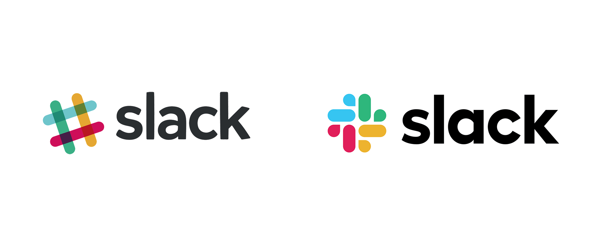
Ok, so here are both logos: old one left, new one right:
I don’t know exactly how I feel about it. Technically it’s better. Brand-wise it’s probably better. The colors aren’t muddy and overlapping. The angle isn’t weird anymore. There was certainly a bit more skill involved in creating this new logo. It definitely looks clean and flat like the rest of the app icons on my phone now. So that’s a good thing. And as a message of “we’re doing well and are therefore updating our brand” it works.
Here are the first things that jump out at me that I don’t like. 1. I can’t stop looking at the blue quadrant and it looks like a ducky. That’s just a personal thing. 2. I personally prefer when there’s some connection between the text and icon…something that integrates the two together into a unique whole, whether this is done by color or graphics. This is obviously not required in a logo. This is just a personal preference. And certainly not necessarily an important one for their brand or its survival. But when you look around at the logos of large, well-established companies, this is generally done. This way the stark black text doesn’t look like an afterthought like “Oh, just stick the name in there somewhere.”
That said, I CAN see the communications aspect of what Slack does in this new logo, a chat bubble and a text field. Simple. Truthful. And much more accurate than the angled hotdogs-hashtag image they’ve used since they started. The hashtag is…sort of a feature of Slack, but it’s not really the core of who they are. That’s more the core of Twitter, which confused me initially when I was first looking into Slack years ago. My first question when I saw the logo back then was “Why do they have a hashtag in their logo?” And even after I saw how the channels had a hashtag in front of them, that question was never really answered for me. So NOW they have a logo which accurately represents who they are and what they do. And that’s miles better.
So do I like the new logo? I wouldn’t say that I do. Is it a GOOD logo? Probably. It definitely is more representative of a company which helps team members communicate with each other. And it’s clean and bright with nice bold text. Looks more like a successful tech company to me. If I didn’t know who they were or what they did and I saw that logo, I would think they are a legitimate company. So that works. They’re going public, after all. Looks like they’ve put on their best jacket and polished their converse. So good on them.


Leave A Comment