When in Silicon Valley…
by Erica Falke, Creative Director; July 2018
The Problem
Doctors’ Speakers Network is a team of doctors who give lectures on nutrition and wellness to clients in Silicon Valley and surrounding areas. They’ve worked with companies like Adobe, Sony, HP, Symantec, Netgear, Samsung and many, many others. And while the information they provide is very much 2018, their visual brand, and the design and functionality of their website needed to be just as current.
Before:
Company Bio
The Doctors Speakers Network is a Silicon Valley-based organization founded by doctors committed to helping local companies provide health and wellness education to their employees – for free.
Industry: Health
Location: Silicon Valley, CA
Size: 6-10 staff
Client Testimonial
“On behalf of Adobe Systems and BaySport, I’d like to commend the Doctors’ Speakers Network for their outstanding service in health education and lectures they’ve provided here at Adobe over the recent years.“Their expertise has consistently been well received by the Adobe clientele and has reflected with positive feedback.
“Thank you kindly for the exceptional service!”
– T.S., Adobe
The Assessment
STRENGTHS: The company’s wonderful services, reputation, and major endorsements by giants in Technology in Silicon Valley made this actually easy. There’s no spin needed. It was just a matter of showing them off and getting the functionality of their website into the present.
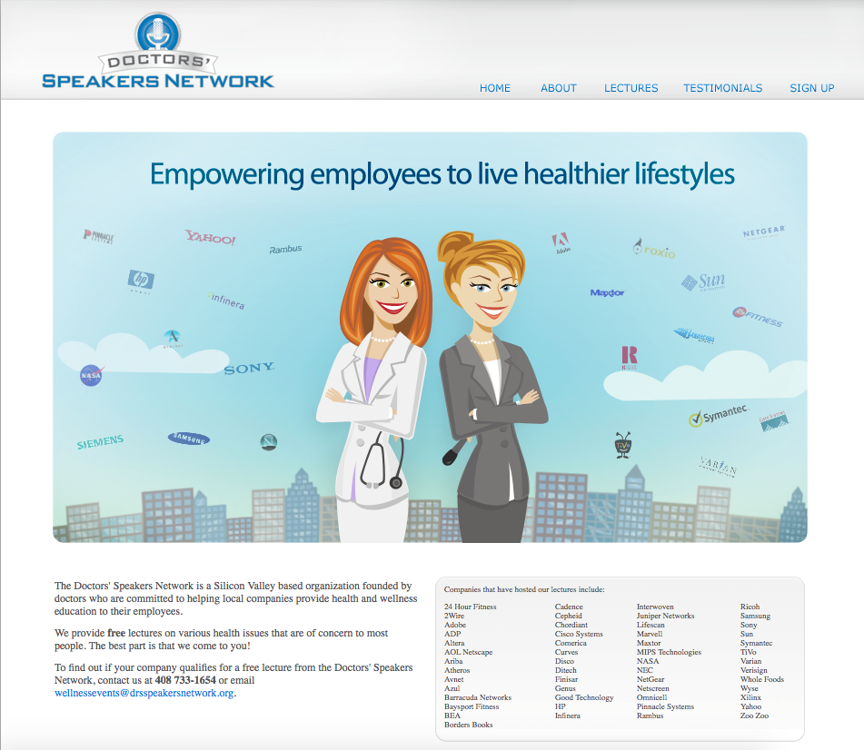
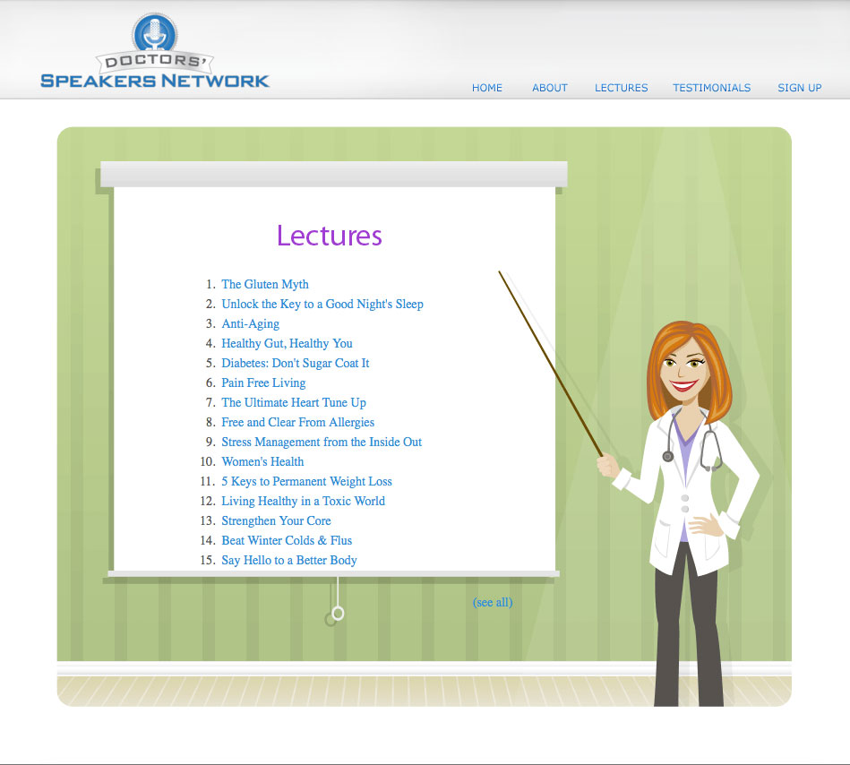
WEAKNESSES: A dated logo, a dated website. All images were caricatures, which is fine for certain industries. But this is healthcare, so not so much. Zero interactivity possible, site not responsive. In a culture of mobile shopping, chances are good that anyone signing up for DSN’s services would want to do so from their phone. Or at the very least see what services were available, and browse the lectures from their phone. None of this was possible with the old site, except in the old-fashioned way of zooming the page on your phone and moving around to see all the parts.
OPPORTUNITIES: California has always been a leader in health trends. Management of corporations in California want to know how to create the most productive work environments possible. And they know that the health and well-being of their staff is one of the main ways this is accomplished. Nowhere is this subject of greater concern than Tech HQ, Silicon Valley. So DSN’s services are most DEFINITELY needed in Silicon Valley. Now to show what this team of amazing doctors is already doing in the best light possible.
THREATS: With the reputation DSN already has in Silicon Valley, unless TED Talks start convincing people that fast food is the future and good health is pointless, DSN should be just fine.
The Brand
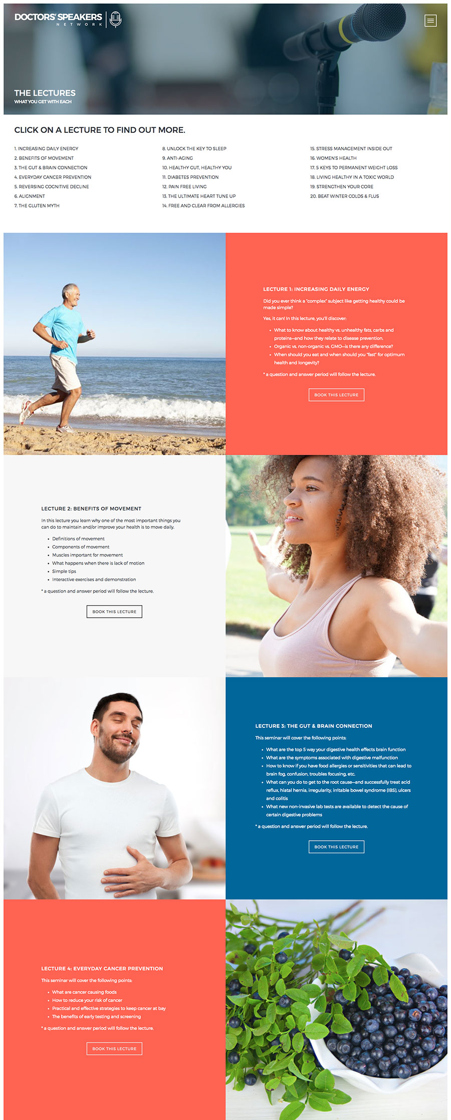
First thing was the brand. The subject matter is health, nutrition, well-being. What DOESN’T communicate those things is the color gray or cartoons. If you look at the screenshot of DSN’s old site, you’ll see their logo top left. So we started from scratch with a clean, minimal logo which would maintain the communication of who DSN is what they do, while discarding everything that didn’t communicate a company that’s armed with all the latest technology and trends of healthy living.
From there it was onto the website. Here we created the right color palette, clean modern font pairings, and put it all together with great photography and graphic elements, and added all the functionality that would allow the user to easily view the website and interact from any device.

The Website
After the brand issue, there were still two other big situations to handle with this website.
1. No Visuals
There were no photos. You couldn’t look at the site and actually SEE what DSN does or browse the lectures. You could dig around and read and find things. But with marketing and advertising, it’s vital to have visual representations. With direct mail for example, you probably read it over the trash. Most people do. This means as a person selling or promoting or advertising something, you have an INSTANT to make an impression on the recipient of the mail. With digital marketing it’s the same. If a person can’t see at a glance what this website is, or something interesting enough to make them want to scroll down, you lose them. It’s brutal that way.
2. Too Long a Runway
In order to sign up for a lecture, you had to click through multiple pages of text to get to where you wanted to be, and then if you weren’t already signed up with DSN, more clicks. That’s too much work. People want an easy, smooth web experience that isn’t confusing or time-consuming.
Solution:
We created a Lectures page which allowed the user to really see–with images, text and interactive design elements–every lecture available, along with its content. We also added a Featured Lectures row right on the home page that a person can hover over for more details and to book that lecture.
An additional feature we made use of on the Lectures page is “anchor links”, meaning when you click on a lecture title at the top of the Lectures page, you’re automatically taken to the exact place on that page where that lecture is featured. So you can choose to scroll all through 20 lectures or just go straight to the one you want. Then sign up right from there. This solved the UX problem of “too long a runway” to get to the signup page. See the page in action here.
Before & After Signup Page
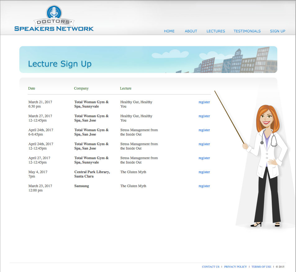
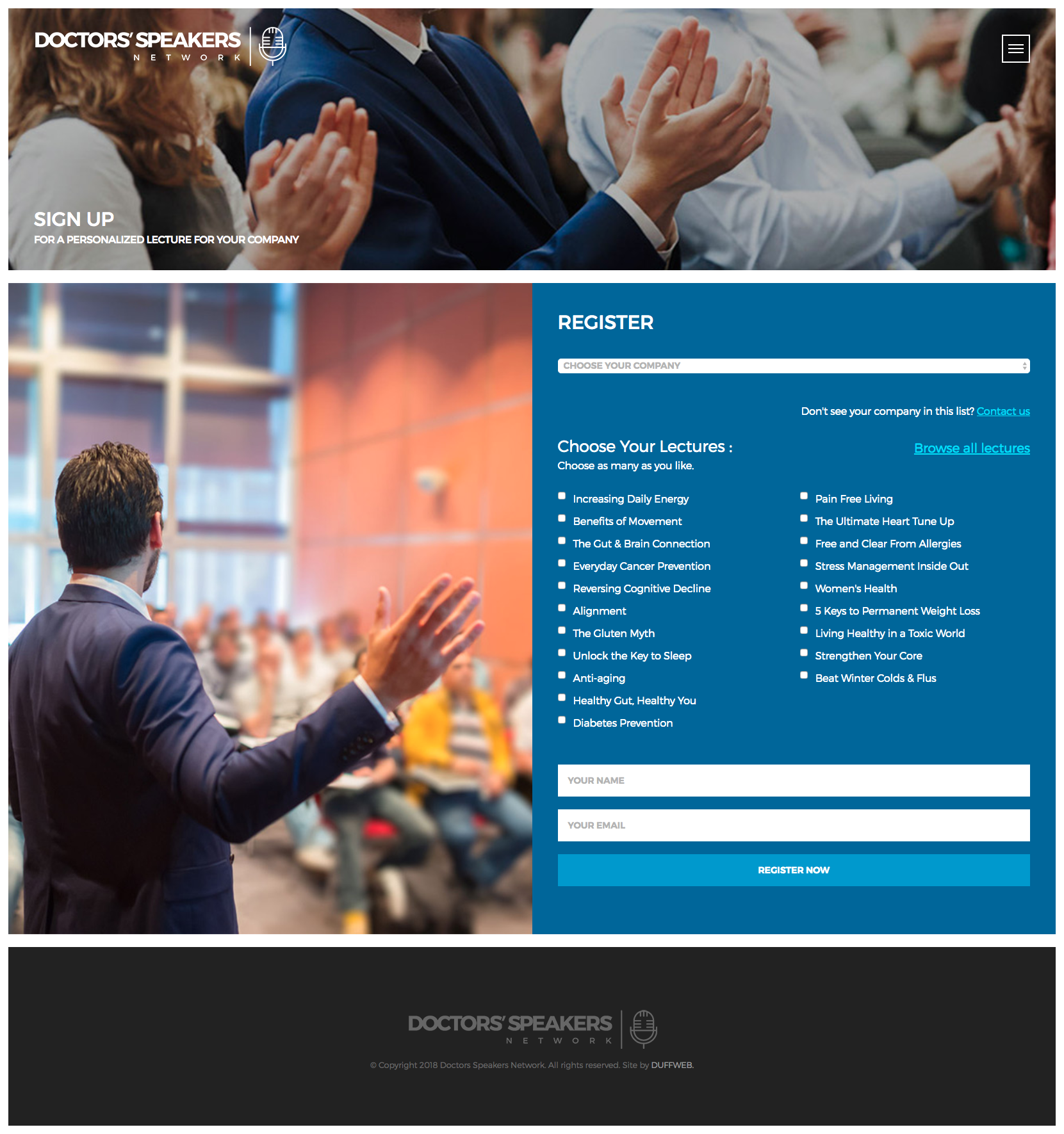
To the left is the Before | After slider of the Signup page. The signup/booking form used to require multiple clicks to find, even when you went directly to the Sign Up page. In fact, the Before image in the slider you wouldn’t actually see until you clicked on the Signup page and then one other button on that page. It was basically hidden from view.
Now you can see lectures on the home page or Lectures page and click straight to booking. Or you can go directly to booking on the Sign Up page. This makes a much smoother user experience.
The Outcome:
Now DSN has a brand and website that clearly communicates who they are and what they do in a way that’s appropriate for their Silicon Valley public. The site is easy to understand and navigate, the services offered visually reflect the awesomeness of what they are now. See The Full Monty.

Leave A Comment