by Michael Duff, Founder & Design Czar
We’ve had web design clients tell us their sales increased as much as 125% after we redesigned their site. While we love hearing numbers like that, we don’t believe an increase in sales is the main reason why design matters. Sales is only a by-product of good design and to us it’s not even the most important part.
Isn’t Sales the Whole Point?
Well yes, money does make a company float. And no sales = no money = no company. But I’m talking about one of the biggest problems unsuccessful, and even merely semi-successful companies have that they don’t even know they have. I’m talking about poor design all the way from industrial, architectural and website design, down to even a business card. Here’s why design matters so much: perception.
Perception Beats Sales
 I have lots of pro salespeople friends who are excellent at their jobs and will vehemently disagree with this above statement. And while well-trained salespeople are indeed invaluable, without good design even a great salesperson doesn’t stand a chance over time.
Here’s an extreme example: Let’s say you went to a store called “Hammerman’s Hardware” and get sold a new expensive cutting-edge “Hammerman’s” hammer by a very well-spoken, well-dressed man who really seemed to know his hammers and treated you like royalty. You leave totally happy, bring it home excited to hit nails and are stunned to find that there is no handle. It’s not missing. It’s obvious that there wasn’t one ever in the plan.
A few things are likely to happen:
- Your perception of the salesman crashes. “That dirty @!@^!@%$”
- Your perception of the store or brand is shot. “What were they thinking?”
- You’ll probably bring it back, and after yelling at all involved you’ll tell all of your friends about it and now their perception of the store and brand is bad.
- If this design flaw is not corrected quickly, the store and brand will fold after enough “word” (perception) gets out.
But it wasn’t the fault of the salesman. He did his job. It was the designers of the hammer who didn’t do theirs.
Design Centric = Sales Centric
Let’s say you drive a friend’s car. As soon as you put the seat in a good place for you – which, by-the-way, seemed really easy to do – you sit and look at the dials and layout of the interior. Everything seems to be where you would expect it! That’s weird. But it’s only weird because your car isn’t that way. You realize yours has this inconveniently placed under here and that function is hard to get to and… Then you snap back into being in your friend’s car and it’s just, nice. Comfortable. Easy. You feel relaxed.
How often do you feel that way? Having had the above experience you’re probably going to look for that car or one just like it the next time you’re in the market. You’ll want that correctly designed experience as often as possible.
Here is one of the main reasons why design matters if you want sales:
PART II
Design Is A Communication
 We believe that your website, like a well-trained salesperson, should communicate to your visitor in a way that they understand. We’re not talking Siri or Alexa type communication (although you know that’s not far off) but the design should tell them “relax, you’re in the right place, and you’re in good hands.” It should make them feel comfortable. It should help them achieve the goal they’re trying to achieve, and as quickly as possible. We assume that goal is probably the same one you have for them too!
And who is the salesperson for your website? If you guessed the site design is, you get a gold star! A website has to be designed to be the salesperson, and to communicate all of the above just like a great salesperson would. And by-the-way, that website salesperson must work perfectly 24-7-365, on any format, and any device: desktop, tablet & mobile.
Award-Winning Doesn’t Mean Customer-Winning
Some firms design mostly to win awards for their firm. This is the opposite end of the poor design spectrum. And while I can appreciate bleeding-edge design pushing the boundaries with super high “Wow” factor, if it’s a site where people are depending on sales to keep the doors open (VC-funded businesses are not included), keep the visitor guess work out of it. It still needs to be usable to a very wide audience.
We believe the best practice is to design for the clients to win customers and for those customers to keep returning. You design for a great user experience which leads to a positive perception and long site visitor relationships. If you win some awards along the way that’s cool, but keep the communication of the design as one from the site to its visitors, not to a judges panel.
And here’s an article from Nielsen Research which splashes a very cold bucket of water on our idea of how savvy people are on their computers.
Key Points to Every Design
All sites are different, even though they all share the same purpose (trying to sell something) and I personally find that I buy from sites that respect my time as valuable and assist me in getting to what I want, letting me buy it and getting on with my life. Some surveys show different times on the site deliver different conversion rates and to do this right you need to look at all of the variables.
There are a few really key points every great website design needs:
- Correct and sane navigation to easily get people quickly where they want to go
- Having a search helps speed up the above process
- Having a great design flow is key to actually move the site visitor’s eye from start to where you want the finish to be.
- It has to look timely and beautiful (whatever the current version of beautiful is) which means you should probably be redesigning it every few years.
And remember, even if your site isn’t an e-commerce site, you’re still selling SOMETHING; your brand, your business or idea. Our site doesn’t have a shopping cart either but we sell the fact that we are really good at what we do. At least the clients that trust us with about $100 million of their annual sales think so. They trust us to create the experience their clients have on their sites, which leaves them with a great perception of our clients’ brands. It’s a win-win.
PART III
Passes and Fail
Here are a couple of quick examples (not all bad!):
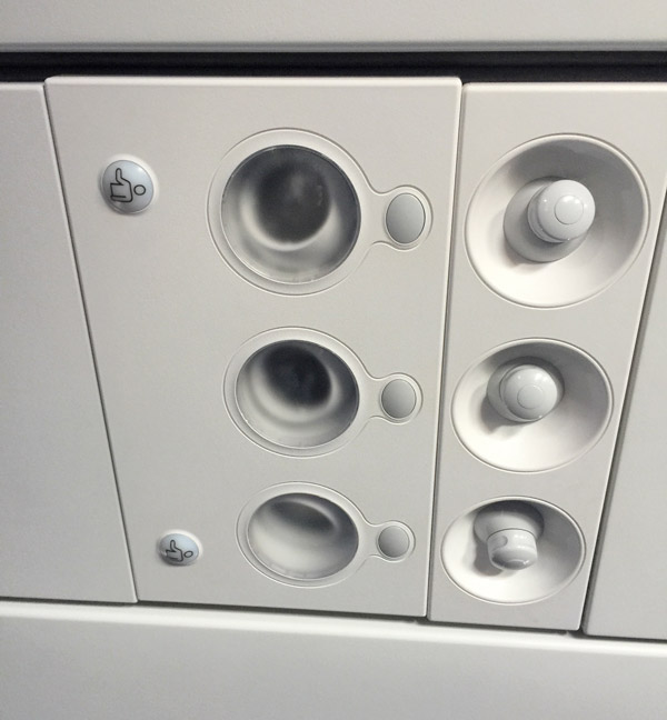
When I travel I like to rent different cars. This last trip got me into a Lincoln Continental (Alamo has some amazing deals sometimes!). I thoroughly enjoyed the ride and it’s comfortable as heck for a tall guy like me, but I was completely flustered every time I tried to get out of it. Take a look at this image below:
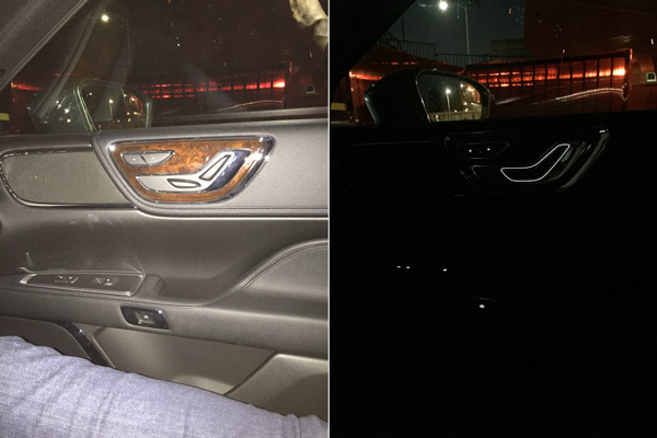
How do you open the door? Well, it’s that little button on the door handle. It’s not that big, glorious, obvious wood-panel and chrome beacon of attention that I reached for EVERY SINGLE time. That space is reserved for the seat adjustment. What? And look on the right at the importance these elements get at night! Holy cow.
Even after almost a week of driving it (and quite a lot of travel) I continually reached for what should have been the most obvious part of the door: the handle, but then had to (with choice words under my breath) then reach down to the tiny thumb button and open the door.
Below is another design fail, this one from JetBlue (who I actually love as a carrier). It’s great that they have nice-sized screens on the seat back in front of me, but I found that I can’t watch something while also having my arms on the arm rests because I constantly change the channel or the volume – or even worse, do that to my neighbor. It’s like when you sit on your remote on your couch. Annoying! Guys, it’s called an Arm rest!
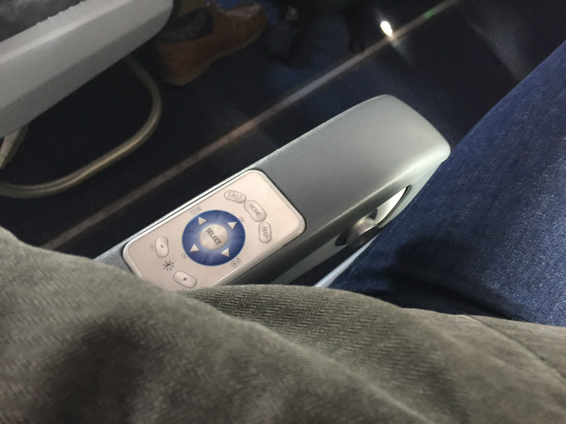
Below is a pass. This is also on a JetBlue plane: I looked up and within half a second I knew exactly which button to press to turn on my light. I didn’t mistakenly call the flight attendant or turn on the fan. The design of the bezel showed me all I needed to know. Ahhh, so nice!
ALL of these design ideas and many, many more are what go into our discussions when we are plotting out and designing a website. How obvious are the important elements? What are people used to doing? Are we being “too” clever or cutting edged, etc.?
It’s All About The Experience
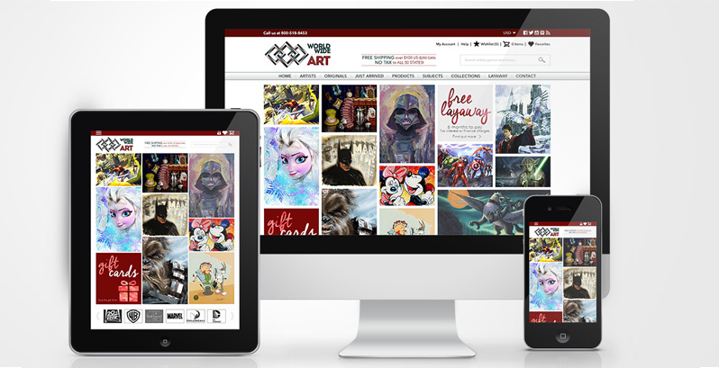
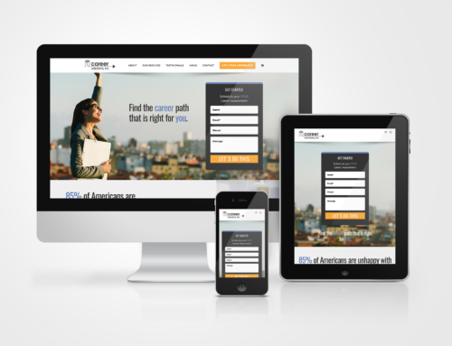
This is the “before” of the site you see in the banner at the veru top of this post. We redesigned and reworked everything: function and flow.
To conclude my point, think of a website you’ve visited where the experience wasn’t very good. It can happen for lots of reasons:
- Dated look
- Poor “flow” from one page to another
- Inconsistent navigation
- Poorly planned navigation
- No search
- Poor photography or images that were too small
- Inappropriate color choices
What is your perception of the company who owned that site? How much business did you do with them? If it was a bad experience chances are it wasn’t very much. And here’s the bigger question: how much REPEAT business did you do with them? Lifetime Customer Value is a huge consideration and design is about as important as it gets in that regard.
OK. Now think of a website you’ve been to which was really smooth and made you actually feel comfortable. Things probably made sense and you could get where you wanted easily and quickly, right? Feels good, doesn’t it?
Mirror Time
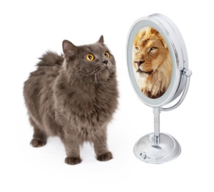
Be honest. What does your site
actually look like to your customers.
Now think of your own site. Be honest.
Look at it from the viewpoint of someone visiting it for the first time. What will their experience be? What will their perception of your company be based on that experience? Now compare it to your competition.
That’s what we do when we’re designing. We want your site experience to be better than any of your competitors. We want the perception of those who visit your site to be such that they feel like you care about them and their time, and they’ll come back again and again because you designed your site with their experience in mind.
It all starts with a good design leading to a good experience leaving your site’s visitors with a good perception of your company. And more than likely buying from you, again and again and again.
That’s why design matters. That’s what we can do for you.
Leave A Comment