The 5 Website Fixes That Boosted SuperSalve’s Sales by 110% in 1 Month
The Good: SuperSalve = Super Amazing Product
- All-natural, ethical skincare.
- 100% natural, ethically-sourced and handmade.
- No GMOs or harmful chemicals
The Bad: 4 Problem Areas
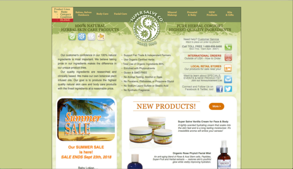
- Problem #1: Too Much Text, Not Enough Photos
- Problem #2: Not Highlighting Endorsements/Social Proof
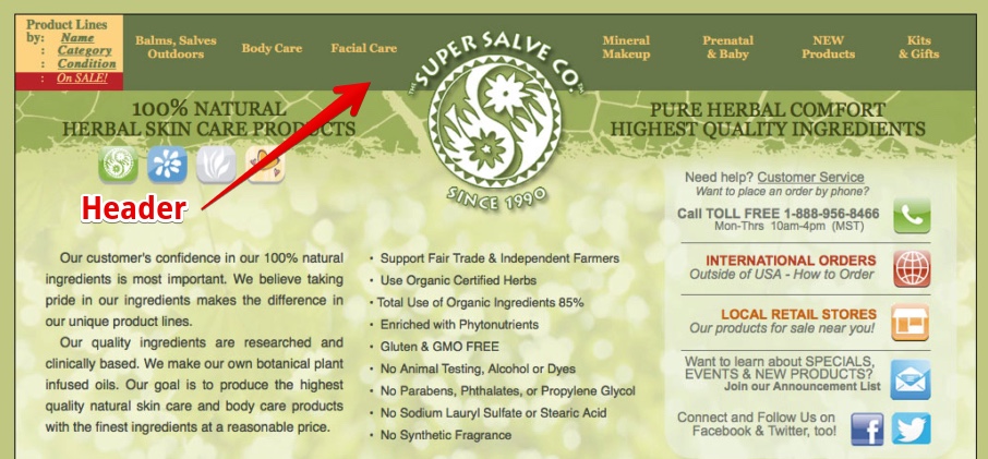
- Problem #3: Cluttered Header & (Seriously Important) Missing Elements
- Problem #4: Out-of-Date Color Scheme
The Ugly: 1 Seriously Out of Date Website
Here’s How We Fixed It
Problem #1: Too Much Text on Their Site
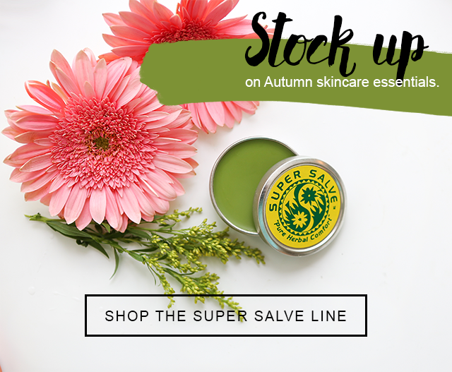
Solution: Reduce text, add more pictures (and feature the bestsellers)
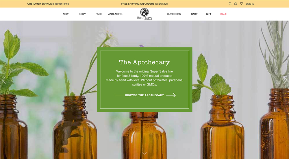
As you can see above, we wanted to make SuperSalve’s website less “Las Vegas” (too much text that’s hard to read) and focus instead on great product shots. Not only that, we wanted to really bring their products to life with what we call “lifestyle photos,” showcasing their bestsellers. Here’s an example of how we did that with one of their bestselling products:
These aren’t just your garden-variety product shots. They showcase the herbs and botanicals inside the product to truly communicate through a cell phone screen or computer monitor the essence of the product itself. (These also make for great email images to engage your buyers.)
Problem #2: Not Highlighting Endorsements/Social Proof
Solution: Feature Any & All Celebrity Endorsements or Testimonials ASAP!
People can be distrustful of buying products online. (Have you ever received a “great buy” from China that was 10 sizes too small?)
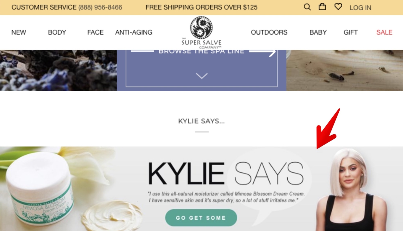
SuperSalve has tons of enthusiastic testimonials but also has a shoutout from one of fashion & beauty’s biggest names: Kylie Jenner.
We were sure to call this fact out in a MASSIVE way on their site, as you can see here:
Can you say cha-ching?
But even if you don’t have a massive celebrity that’s endorsed you, you’ve got testimonials (if not, you need to get some!) and your raving fans I’m sure would love to send you a photo of themselves or even a video testimonial to endorse your product.
Problem #3: Cluttered Header/Menu & (Seriously Important) Missing Elements
Solution: Make it Like Amazon’s
Most online shopping is done on Amazon.com. (Prime Members, anyone?)
Although SuperSalve’s old header menu clearly laid out their top categories, there are important things missing. (Like, where’s the Search?)
Ezra Firestone, e-commerce legend, talks about how 5% of your visitors will use search but they can make up to 30% of your sales.
That was just one of the items on the header menu that we made it much easier to find with their new and improved header below:
New Site:
SuperSalve was also missing something huge which everyone now expects (because again, Amazon has taught us), there was no shopping cart button anywhere to be found. So we went ahead and made sure to include that. More on that coming up…
When in doubt, make your store as similar as possible to Amazon’s look and feel.
Problem #4: Out of Date Color Scheme
Solution: A Smart Update of Color Palette (But Keeping True to Their Brand)
Depending on your client base, you’ll want to have an appealing palette of colors that communicates your brand’s value instead of turn them off. And in the case of SuperSalve’s old website, we got the message of “old refrigerator” – not botanical-packed awesomeness.
We have an entire (free) guide here on choosing the right colors for your site.
The Ugly (Problem #5): NOT Mobile-Friendly + Antique Website Design/Platform
The Solution: Shopify saves the day!
We’ve seen a lot of e-commerce platforms but we hadn’t even heard of the platform SuperSalve was using.
Most of your shoppers will be using that magical smart phone device when they get introduced to your brand, especially if you’re running Facebook and/or Instagram ads.
So. Your. Site. Must. Be. Mobile. Friendly. (aka Mobile Responsive)
This means your site looks great on a Desktop computer but also on any standard smartphone like an iPhone.
We can’t say enough great things about Shopify. Simply put: They are lightyears ahead of every other platform.
They have more tools you can install than any other platform.
They have more development than any other platform (meaning it’s always becoming better).
They are the standard.
So… Want more help with your site?
Know that your product has so much potential but feel like you’re being slowed down by technology?
We’d love to offer you a Free Diagnostic Assessment of your e-commerce store.
We’ll scan it and give you suggestions – FREE – right within FB Messenger and give you our Top 3 suggestions for your site.
(Click “Get Started” inside Facebook Messenger when asked.)
The catch? There is none. We want to assist you in increasing your sales and getting your product’s value out to the world.
