by Erica Falke, Creative Director; October 2018
The Problem
Super Salve is an all-natural, ethical skincare company. All their products are 100% natural, ethically-sourced and handmade without phthalates, parabens, sulfates or GMOs. You can practically eat these products. Trust me, I’ve been tempted. They smell amazing, they work like magic. And Super Salve has quite a dedicated following of customers and store owners who love and use their products. They’re right on the money as far as current skincare technology and trends are concerned, but you wouldn’t have known it from their website or their marketing. Their website had so much text it was difficult to navigate, it lacked current functionality, didn’t work properly on mobile devices, contained lots of dated graphics, and the product photos were too small to really see the awesomeness of what they offer. The Super Salve girls were just so busy making, packaging and selling their exceptional products, they never really got around to updating their website or implementing a marketing plan appropriate for 2018.
Before:

Company Bio
The Super Salve Company’s goal is to produce the highest quality all natural skincare products with the finest ingredients available at a reasonable price, using only recyclable, earth-friendly packaging.
Industry: Beauty/Skincare
Location: New Mexico
Size: 11-15 staff
The Assessment
STRENGTHS: The company already offers the highest quality of natural skincare products you can get, and has a good following of devoted customers and stores.
WEAKNESSES: A dated website, dated graphics, small product images, not optimized for mobile viewing or purchasing. No real traffic-driving campaigns to speak of.
OPPORTUNITIES: A major category of the skin care market boom of 2017, which has continued through 2018 and is forecasted to continue at least to 2024, Forbes called “Skin Care from the Earth”. This category of skin care products includes natural, organic, clean and even food-standard products, and represents a turn away from the products our parents used, and a search for healthier options. There is a viewpoint that there is a correlation between skin care and wellness, that what you put on your skin and hair is as important as what you eat and how you care for your body in general. And this has fueled the increase in sales for this category.
THREATS: With this booming industry, there’s no lack of competition of natural skincare products. Some very major companies even promote themselves as being healthy, while using minimal natural or organic ingredients. It’s considerably more expensive to produce handmade, all natural skincare products without sulfates or GMOs or phthalates or parabens, as these chemicals have been the ingredients used for a very long time in skin care and are readily available, don’t require a good harvest of a plant grown without pesticides, etc. The challenge will be creating a marketing campaign with email, social platforms and advertising, within the existing resources, which can get Super Salve known to the world, despite the corporate skin care empire of pretended healthy products, and getting Super Salve known as the company that actually delivers what health-conscious people are seeking.
The Brand
They already had an overall logo, as well as logos for each of their 3 main product lines. While we may update/change all of these at some point, the main priorities were website and marketing. But we did need to make a few small, but vital, changes to the main logo. As you can see in the image above, their old logo (left) had a green outline, a drop shadow, and text that followed the path of the edge of the logo. To modernize this, we just flattened it, got rid of the drop shadow and outline and changed the arrangement of the text for a bolder, cleaner look (right).
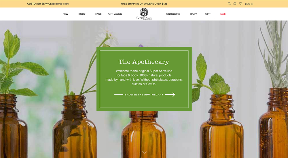
The Design
With that key brand issue sorted, there was still the website itself to contend with.
1. Dated look and feel
In the 60s there was a trend where kitchen appliances were gold or olive. Well this isn’t the 60s and it’s not my mom’s fridge. So all bets are off. It’s time for some 21st Century color up in this hizzy. We still wanted to keep the appropriately natural colors of yellow and green, but different variations of those colors, and combined with splashes of cooler colors for balance.
Pssst: Slide arrow on image below to see before and after.
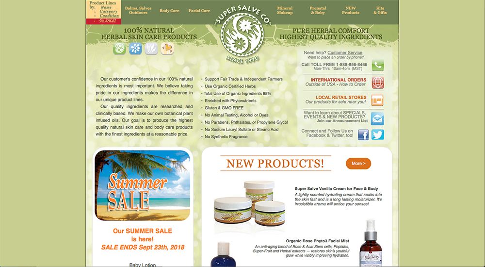
2. Confusing user experience
While all the information the user could ever want WAS on the old website, it was literally EVERYWHERE. There was so much text and buttons and icons of various colors, the site looked cluttered, there was very little space, and it made a hard-to-breathe, hard-to-navigate experience on the site. If you’ve ever been to Las Vegas, you know the whole strip is just covered with lights and messages and signage and it’s confusing. For this website, we needed a little less Las Vegas, and a whole lot more New Mexico.
Solution to #1:
For the look and feel, we came up with a soothing, spa-like color scheme that kept the green and yellow, and added a few other surprise accent colors. The idea is the yellow we chose would be the hero, then main accent color for buttons and icons would be green. Title text would be a dark charcoal. And each product line in the slider on the home page would feature one color. We used big, bright, clean images, and font pairings which were interesting and current.
And of course we created a Web Styles Guide so there was a standard for colors, images and text…on the website, as well as on all future brand and marketing items.


Solution to #2:
To handle the lack of space and confusing user experience, we simply added space and put some order to the flow through the site.
On the home page you can find all the main categories of what you might be looking for, in the navigation, and in the main category slider. Then some featured images, an ad for the new promotion, another explanation of the 3 main product lines, another slider of some sub-categories which break down the products differently, an instagram feed and a footer. Minimal text, maximal images. And plenty of space between the sections and from text to edges. That gives breathing room.
The same goes on all pages: we ensured the text that’s needed is there, along with nice big images and plenty of space between elements. See example of a single product page below.

What about the Marketing?
Yes, we did mention something about marketing, didn’t we? Once the site launched September 1st, we were able to get rolling with our marketing plan. So we’re really just getting started. But here are a couple statistics for you for this month so far, as compared with the same time last month. Total Sales have increased by about 120% and Total Sales Attributed to Marketing Campaigns has increased 7,940% – yes, almost eight thousand percent! And we’re just getting started.
Here’s a little something from a recent email campaign we launched.

The Outcome:
Super Salve now has a website which is every bit as cool and current as they are. The user can now easily see what’s available, find their way through the site, get their questions answered, and make purchases on any device of any size. Now our focus is on driving so much traffic to it, they need to hire an army of staff to handle it all. We’re well on our way.


Leave A Comment