
1. ULTRA VIOLET

With Pantone choosing Ultra Violet as the 2018 Color of the Year, we are already seeing it in everything from interiors and photography to nail polish and hair color. This trend applies to all forms of design for this year. Some of the words generally associated with the color purple: Royalty, Decadence, Mysticism, Elegance, Romance, Nobility, Luxury, Power, and Ambition. So if you’ve ever considered some purple in your brand, this is the year to do it! For more info on color meanings in design, you can read our earlier post on this.
2. COLOR TRANSITIONS

Not a brand new trend at ALL, but definitely one that continues into 2018. Color transitions like gradients and duotone (explained below) are a couple ways designers are rebelling against the flatness in design of recent years. Companies large and small have jumped on the gradient train for their websites, logos or entire brand.

What is this DUOTONE thing?
Duotone is an image made of two colors. It’s currently used in photography or graphic design with black and white photos. The black is replaced by one color and the white is replaced with another. The effect can be quite stunning. Spotify started using this in their brand in 2015. And it’s pretty much gone crazy since then.

3. SEMI-FLAT DESIGN

The flat design trend isn’t over yet. But it’s slowly phasing out, in favor of more natural shapes, more realistic shadowing and depth of field. In graphic and web design, everything is essentially flat. web and mobile screens are flat. Adding depth creates a more human experience and is also helpful with visual hierarchy. Looks like drop shadows are starting to make a comeback in 2018.
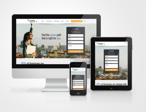
4. MOBILE FIRST

This is a map showing mobile thumb positioning. It comes from this awesome article from Smashing Magazine. Since mobile has now surpassed web in both viewing and online shopping, websites MUST be responsive and easy for the mobile user. Fixed bottom menus, large icons, bright colors, giant headlines, fast-loading animations, and anything that makes it easier to see and do on mobile will be what’s in this year.
5. MORE SERIFS

It used to be that only a few font families were appropriate in web or mobile design. But with the continuing increases in screen resolutions and sizes, many font families that used to be extremely hard to read on mobile screens no longer are. So this year we expect to see more font variation in titles especially. This includes handmade fonts, serifs and slab serif fonts. As a note, Sans serif fonts are still, and will always be the most legible for small text. But we can now get way more creative with larger text in titles and headlines. Yay! Want more information about fonts? We made an infographic of that too. 🙂

Leave A Comment